Friday, December 23, 2016

Some notes on corpora for diachronic word2vec

I want to post a quick methodological note on diachronic (and other forms of comparative) word2vec models.

This is a really interesting field right now. Hamilton et al have a nice paper that shows how to track changes using procrustean transformations: as the grad students in my DH class will tell you with some dismay, the web site is all humanists really need to get the gist.
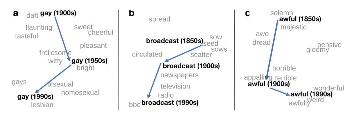
Semantic shifts from Hamilton, Leskovec, and Jurafsky

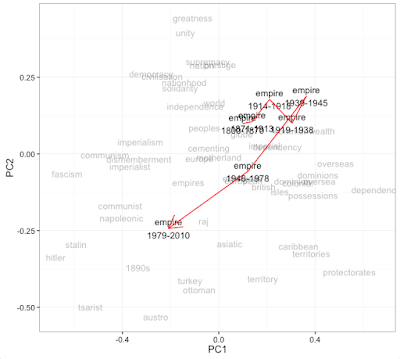
I think these plots are really fascinating and potentially useful for researchers. Just like Google Ngrams lets you see how a word changed in frequency, these let you see how a word changed in *context*. That can be useful in all the ways that Ngrams is, without necessarily needing a quantitative, operationalized research question. I'm working on building this into my R package for building and exploring word2vec models: here, for example, is a visualization of how the use of the word "empire" changes across five time chunks in the words spoken on the floor of the British parliament (i.e., the Hansard Corpus). This seems to me to be a potentially interesting way of exploring a large corpus like this.

Tuesday, December 20, 2016

OCR failures in 2016

This is a quick digital-humanities public service post with a few sketchy questions about OCR as performed by Google.

When I started working intentionally with computational texts in 2010 or so, I spent a while worrying about the various ways that OCR--optical character recognition--could fail.

But a lot of that knowledge seems to have become out of date with the switch to whatever post-ABBY, post-Tesseract state of the art has emerged.

I used to think of OCR mistakes taking place inside of the standard ASCII character set, like this image from Ted Underwood I've used occasionally in slide decks for the past few years:


But as I browse through the Google-executed OCR, I'm seeing an increasing number of character-set issues that are more like this, handwritten numbers into a mix of numbers and Chinese characters.


Thursday, December 1, 2016

A 192-year heatmap of presidential elections with a y axis ordering you have to see to believe

Like everyone else, I've been churning over the election results all month. Setting aside the important stuff, understanding election results temporally presents an interesting challenge for visualization.

Geographical realignments are common in American history, but they're difficult to get an aggregate handle on. You can animate a map, but that makes comparison through time difficult. (One with snappy music is here). You can make a bunch of small multiple maps for every given election, but that makes it quite hard to compare a state to itself across periods. You can make a heatmap, but there's no ability to look regionally if states are in alphabetical order.

This same problem led me a while ago to try and determine the best linear ordering of US states for data visualizations. I came up with a trick for combining some research on hierarchical and traditional census regions, which yields the following order:

This keeps every census-defined region (large and small) in a block, and groups the states sensibly both within those groups and across them.

Applied to election results, this allows a visualization that can be read both at the state and regional level (like a map) but also horizontally across time. Here's what that looks like: if you know something about the candidates in the various elections, it can spark some observations. Mine are after the image. Note that red/blue (or orange/blue) here are not the *absolute* winner, but the relative winner. Although Hillary Clinton won the national popular vote, and she won New Hampshire in 2016, for example, New Hampshire is red because it was more Republican than the nation as a whole.

Click to enlarge