The basic idea is this. There are enough articles introducing how to topic model to humanists already: the contribution I have to make is mostly about how not to topic model. Partially, that means what sort of mistakes you'll make by using it for quick, easy exploration. That also means that I give some ammunition for the skeptics who want to feel OK about absenting from the enthusiasm: it's also a sort of partial introduction in how to not topic model, both in terms of alternatives (I'm very pleased that a k-means picture is currently on the landing page) and in terms of some arguments for not doing it.(Although after I'd mostly finished, David Mimno told me something about a model he ran recently that blew my mind. More about that later, perhaps.)
The basic idea is: as humanists see that there's something in topic modeling for them, it's become easier and easier to do. And so, there are lots of resources encouraging them to try topic modeling--making it yet easier and more comfortable still. But as it gets easier and descriptions get more abstracted out from how LDA actually works, humanists get ever farther from understanding what the real constraints and problems that LDA produces might be. I wanted to put something out there that acts as more of a cautionary tale: showing the ways that topic models can fail when they're run with default settings, and suggesting a need for more understanding of topics at the level of individual words.
A lot of what's new is just a more structured form of the argument implicit in those two posts. That's an argument with two prongs: first, that doing topic modeling well is not easy; and second, that doing topic modeling poorly usually rests on some shifty foundational metaphors about what a topic is that fails because we assume—however provisionally—that topics are coherent and stable entities. Because of those conclusions, we try to make topics meaningful when in fact, they aren't. Meaning is a social construct, and though topics mimic social constructs, they aren't meaningful themselves. Sometimes it's safe to pretend they're meaningful: but sometimes it isn't.
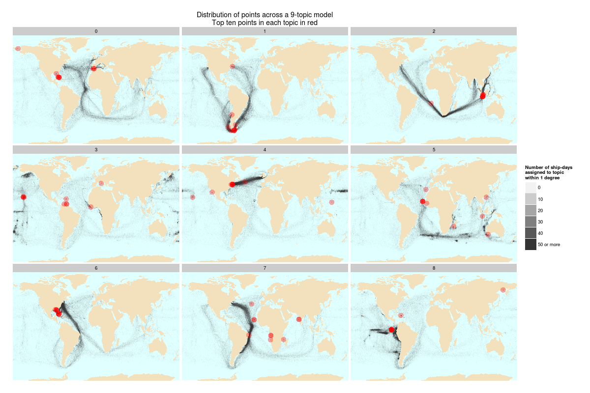
Another change--and this really matters--is that the graphics are improved from the blog posts. A central concern I have is that it's too easy to make topics mean things where they shouldn't. Visualization is one of the best ways to suck the life out of topics and treat them as data, rather than as words with meaning; doing that better is really helpful. Building on a suggestion from David Mimno, I put some better coloration and line thickness into the charts that show how topics shift over time; and thanks to some pushback from Elijah Meeks, I improved the layout of the maps showing topic density of ship logbook readings.
The best improvement was the addition of the top ten points onto the maps, so that you can see just how misleading topic labeling based on the most common words in a topic can be. Frequency, as Meeks pointed out, doesn't necessary correlate with meaning, although it obviously works some of the time. Let me just show that chart here, although the fuller explanation is at the JDH. In addition to the chimera topic, the point is also to look at how imperfectly the red dots (top ten points) summarize "meaning" created by full shipping tracks (black). I do believe that words work better than points, but it's still an interesting limit case of just how misleading top ten lists can be about what topics "mean."
 |
| Click to Enlarge. Even after that, you might want to right click to get it really fully size. |
Also of note: we wanted to experiment with putting a code appendix on the JDH site, so that others can see exactly how I implemented geographic topic modeling and selected PMLA topics that appear split in time. I suspect we haven't yet figured out exactly the best way to do this, but including code for humanities projects is something we
*[edit: obviously others have thought a lot more about this in the past than I, and a github.com repo might make more sense: but there's also something to be said for including the actual code in the right place.]
As always, the revision process was incredibly clarifying, useful, and humbling. (Among other things, in editing two breezy blog posts into one article I was led to marvel again at how different academic prose is from what, in a normal setting, I would take to be ordinary clear writing. As well as how far my writing usually is from "clear.") Thanks to Elijah Meeks, Scott Weingart, and Joan Troyano for their excellent advice and corrections.
As of writing this, I haven't read the other pieces in the volume in detail. So this is certainly far too long an introduction, particularly because I think there are some very well-formulated criticisms by the other authors. But I'm very much looking forward to it.
Lastly, I'd note one omission from the original posts. (Well, two: the title "when you have a MALLET, everything looks like a nail" couldn't survive the transition). For the sake of meaning, coherence, and stability we decided to cut my discussion of the Edenic appeal of taking topics to obliterate the signifier/signified distinction rather than extend it out. That meant you will have to wait for someone to put together an edited volume capturing the budding field of Don DeLillo-inflected criticisms of Digital Humanities overreach to read my argument about how The Names offers a cautionary tale about our wish to take word to transparently refer to things.*
*Bonus inclusion: my long self-censored meditations on what Jack Gladney's uneasy position in Hitler Studies says about the Great Debate About Whether Digital Humanists Need To Code. It's not what you think! And isn't there some big data visualization web page about the history of nuclear explosions at the end of Underworld? We have to get on this, people.
No comments:
Post a Comment