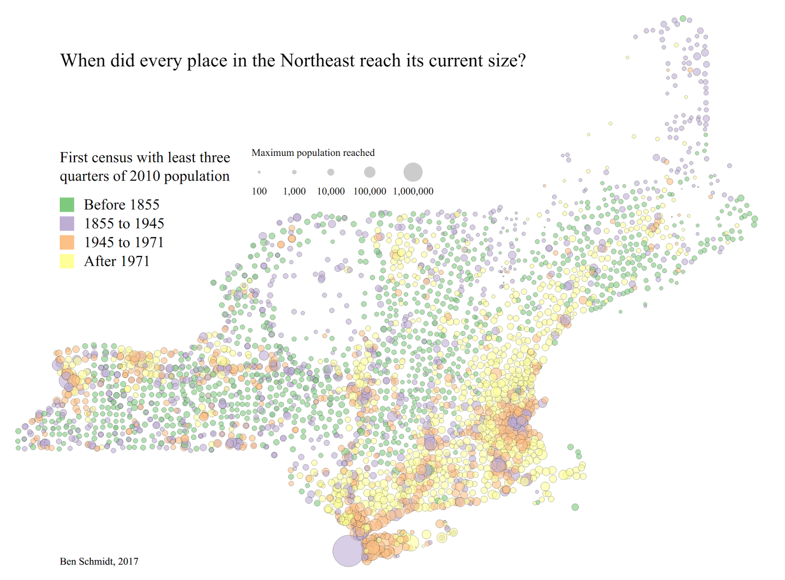
Browsing through it, one thing that comes out immediately is just how long it has been since many towns experienced major growth. There are a lot of ways to think about this (e.g., year of maximum population; year of greatest growth rate) but I like the compromise here, which shows the first year that a town had
There are a lot of features I like here. Most interesting are all the small green dots in the southern tier of upstate New York, across Vermont and Western MA, and throughout southern Maine. In all of these places, it's been a century-and-half since any significant economic growth. The largest in this class is Nantucket, which hasn't seen major growth since losing the whaling industry to New Bedford.
The purple towns are mostly born of the industrial revolution; a few are scattered in the less habitable regions of New York and Maine, parts of which have more in common with the upper midwest than the rest of New England. (There are whole, depopulated Swedish towns in northern Maine; I swear I heard an accent that would sound at home in "Fargo" in Caribou.) The largest are, obviously, New York City and Boston, which stopped growing because they ran out of land; Hartford, Providence, Buffalo, and Worcester are all there too.
Most of the major industrial centers in Southern New England and along the Erie Canal are surrounded by a ring of orange towns which peaked between 1945 and 1971; those are almost suburbs. The largest of these is Hempstead, Long Island, which is obscure enough as a place name that I had to look up even though 1) the town (not the smaller village) has a bigger population than Boston and 2) I was biking in it literally yesterday. It's the lowest third of Nassau county, just past NYC's JFK airport, and includes prototypical suburbs like Levittown. Most of the largest cities like this are New York suburbs; in New England, the largest are Framingham, MA, pretty much every municipality from Greenwich to Hartford in CT, and the Portland suburbs.
Finally, the yellow encompasses almost all the formerly rural portions of New York/New England south of Portland and within a few dozen miles of the ocean. Nantucket aside, there are almost no towns in this area that didn't grow; many of the rare green spots are Connecticut towns like Lyme that have calved off other towns over the year. The largest here, Brookhaven, has half a million people and is essentially the same as Hempstead but for Suffolk county, farther out Long Island.
Is there a grand conclusion to be drawn from this? Well, it does shake my thinking a little bit about one thing. Even stasis, let along depopulation, sometimes feels like a trauma that the United States has never experienced before. If I blow these same legend parameters out to a wider notion of the northeast (plus a smattering of places in Canada), the legend classes cease making much sense at all--there's almost no green in the entire country outside of the region I've plotted here. Partly that's data availability; rural place-name level information from the census would be great to have, but we really only have it for these seven states right now. (Five because of that editor I mentioned earlier; the other two, Massachusetts and Rhode Island, I've pulled straight from the Wikipedia full-text dump).
 |
| Don't bother enlarging this, it's not consistently made, there are weird spots, and the legend is positioned over the map! |
But it's also that there has been at least one destructive pass of the same magnitude as deindustrialization in the past; the wave of de-agriculturation that started in the 1820s in New England as farmers went west, and hit the midwestern cities and towns in full force probably starting in the agricultural depression of the 1920s and, obviously, 30s. Of course historians know that this happened, and it's a commonplace to think of the trials of the shift to a post-industrial economy as on a par with those accompanying the shift to an industrial one. But there's something odd about that phrasing that makes industrialism too central: we don't talk about a post-agricultural economy, and "de-agriculturation" is not a word.
But if depopulation is traumatic, not just loss of jobs, it helps me think about Northern New England in a slightly more complete way. If you go to almost any of these green towns today, the most striking thing in the town square is the Civil War memorial with more names on it than than it seems like the town has people nowadays. How did the proximate experience of depopulation change attitudes towards that war? (That is: how does the fate of the Union look different from an atrophying town in Vermont as opposed to a booming one in Illinois?) Those questions may be well-trod in the literature, but I haven't read them: probably because at least in my grad education, post-civil-war agrarian Northeasterners were uninteresting compared to agrarian southerners of both races, westerners of all stripes, and urban and suburban Northerners.
"There are white people we don't think about enough!" is weak sauce, though, and I freely admit that not even I plan to take this data in that direction.
One weird feature of this map is that it uses a quartic-root scale. So each circle is proportional to the size of a two-dimensional manifestation of a four-dimensional hypersphere of appropriate volume. (Do you call it volume in four dimensions? I dunno). That's an idiosyncratic choice I won't repeat anytime soon. But next up population-density wise, here: maybe a return to the giant floating spheres of the 1930s.
Clarification, please. On your top map's legend, it says "three quarters," but your text below it says "two thirds."
ReplyDeleteOops! Three quarters. I changed it while working on it (there's much of a difference in the map, so I went with the higher number). Editing the text now.
DeleteIt's interesting that the entire Bangor-Bar Harbor corridor has grown, along with most of the rest of the upper I95 corridor, while the towns immediately adjacent have shrunk. Perhaps shows the influence of transport routes concentrating things like tourism.
ReplyDeleteYeah, exactly. This makes me think there could possibly be an interesting nationwide comparison of railroads and interstates. Though I struggle to think of a true "Interstate town" to compare to the many railroad towns out there. My first thought was maybe Houlton, but its population peaked in 1950. I suppose Ellsworth, though it's just Route One, may come pretty close; but Bar Harbor is really growing too, so maybe its just the whole region.
DeleteThere's a pretty close comparison between Bangor and Burlington, Vermont; both are, essentially, the last stop in the country along an interstate and home to a state university. The universities might be helping the places stay large and suburbanize; but also, it makes me think that potentially there's something interesting about how university towns may have received a secondary advantage in that they tend to get an interstate (although at least 2 of 6 New England flagships have no immediate highway, so maybe that's wrong).
One thing I just noticed about the lower map, even though I said not to look at it:
ReplyDeleteIt's especially misleading in Canada because the census years there end with '1', but for these maps I only pulled population estimates for years ending in '0' like the US census.