Start with an example. Let's say I'm interested in social theory. I can take two words—"social" and "political"—and count how frequent each of them is --something like two or three out of every thousand words is one of those. I can even make a chart, where every point is a book, with one axis the percentage of words in that book that are "social" and the other the percentage that are "political." I put a few books on it just to show what it finds:

year creator title
1883 Lester Frank Ward Dynamic Sociology: Or Applied Social Science
1917 Ellwood, Charles Abram An introduction to social psychology
1896 Arthur Fairbanks Introduction to Sociology
1884 William Graham Sumner What Social Classes Owe to Each Other
1893 Herbert Spencer The Principles of Sociology
1903 John Fiske American Political Ideas Viewed from the Standpoint of Universal History ...
This is interesting, but perhaps not informative. I put Spencer and Ward on to illustrate that even when you get into the cloud of books that seem to use the two words not very much, you still get some very topical words: and Sumner doesn't use 'social' very much, even though he's writing about sociology. And, of course, most books don't use either word hardly at all.
We can also, incidentally, plot just one of the words by time: So, for example, here each dot still represents a book, and we can see how the occurrences of "political" are spread out over time:
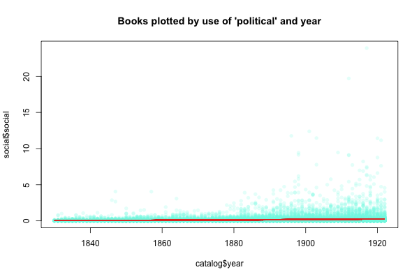
There's some connection between the slightly rising red trendline that creeps along the bottom there and the occurrence of "political" by year, although it's not exact: all these measures are different ways of looking at the same data:

But anyway, just two words isn't that useful. It's often hard to get around several problems:
- The language of society isn't just about using the word 'social'—it's also 'society', 'sociology', some uses of 'people', and so on;
- Almost all of the books are clustered away right around (0,0): so it ends up looking like books that use 'political' and 'social' are far apart, when in fact they aren't;
- The scales are so stretched out that even books we suspect use our words pretty often get lost towards the lower left corner of the graph.
Part of the answer to this: We need something that uses a lot of different words at once. There are a lot of different ways to do that, but let me just start with a fairly simple one here.
Say we want to add just one more word--"spiritual." That's about half as common as political and social, so first I'm going to scale all thewords so instead of getting the absolute percentage for each book, we just find out how much more or less than average it is. That means they'll appear on more roughly the same the same scale. (For now I'm using standard deviation as the measure of how far off they, although I could do better). We could still plot it, by adding the third dimension:

That works OK on my computer, where I can spin the plot around to my heart's content. But as a flat file on the blog, it's not very clear. What you see is just a two dimensional shadow of a three-dimensional object. (That's why the cave references—I really think the allegory of the cave is a great way for humanists to understand PCA.) There are lots of other ways to look at it: it's hard, in fact, to choose which of the many angles we could take to view it with is the best one. And it becomes impossible to visualize once we want to add a fourth dimension (biological?), or a fifth, or a sixth, on to our plot.
Thanks to statistics, though, we can find one candidate for the 'best' view: the one that separates out the points the most from each other. That's basically what Principal Components Analysis does. Out of the three dimensions that we gave it (social, political, spiritual), it makes three new dimensions ordered by how stretched out the points are along them. Because our variables are related to each other (since a book that uses the word political is more likely than any random book to use the word social), those variables will be combinations of the ones we fed in. But they don't actually represent a change--they're just a rotation of the three dimensional space to put its axes in different places.
Using it, it turns out that the way to get the most variation on a 2d plot is to have the x axis be a combination of political and social with a little bit spiritual, and the y axis be spiritual mostly on its own. The third dimension, which mostly distinguishes between political and social, is less important because "political" and "social" occur more often with each other than either does with "spiritual." Here's that view, with the red lines representing the three axes in this projection.

The mostly vertical axis is 'spiritual'; the upper of the two horizontal ones is 'social' and the lower 'political'.
The thing that makes it useful is that this technique isn't just limited to three dimensions. Let's add a whole bunch more to illustrate: all the months except March, May, and August (since those words have other meanings in English) and June and July (I don't have the numbers handy). We'd expect the use patterns for those to be quite different than the abstract adjectives we have so far. Even though we now have 10 dimensions, it's still possible to project them down to two:

(I made this one wider than it is tall because PC1 explains a lot more of the variation than PC2, but it's not exact.)
Each of those red lines, in 10 dimensional space, is at right angles to each of the other ones. Whatever that means. Basically, though, it's a way of combining the dimensions together. The three vertical axes that get projected are 'political,' 'social', and 'spiritual'; for their differences, they still appear in the same sorts of books as each other compared to the months. Most of the time, PCA won't cluster so clearly into two different groups of variables. (Although choosing data that force it to do so might not be a bad idea from time to time). It's just that we've picked terms that are closely related to each other.
Edit: So what can we take away from a graph like this, Jamie asks? First off, the fact of the correlation between the variables--the points are notably spread out along each of the sets of axes, which means: it's possible to separate out what we could call 'the language of month use' from 'the language of big-picture adjectives'; if they were more similar, there wouldn't be so much space up in between them. Second, we could identify books that occupy any portion of the graph if we wanted--if we're interested in books that use _both_ monthliness and big-pictureness, we can pull out the books that are the highest on each, and ask other questions about them: What year did the two vocabularies start being combined? What other words are used disproportionately in them? What language is excluded? etc. And there might be some use to finding the outliers on each axis--the books that use monthly language the most, say. We can guess those are going to be biographical dictionaries or almanacs or something else boring like that. But with other vocabularies, it might more useful.
How do we know, empirically, that different clusters are words are closely related? Well, we can keep thinking of things dimensionally. Instead of plotting 25,000 books in 10-dimensional space, one dimension for each word, we can do the opposite: plot 10 words in 25,000 dimensional space, one dimension for each book. (Crazy, right?) If we do that, the first two principal components space the words out so:

The first and most important component--right to left--separates out the months from the abstract adjectives: the second one, top to bottom, tells spiritual apart from political, with social much closer to political. This maps pretty well onto semantics, obviously. But there's no reason in particular to use these two components with each other: we can get a wholly different view on the data by plotting it by the third and fourth components:

Here left to right tells political apart from spiritual (since those were two words pretty close to each other in each of the last dimensions that have significant usage distinctions) and top to bottom finally gets around to disentangling the months. Except for April, which isn't part of the series anyway, it even lines them up in order: sept-oct-nov-dec-jan-feb, from bottom to top, based on their patterns of usage.
That highlights, I think, just how useful this can be: we can cluster terms together based on their similarities in a family tree of difference. Using all 25,000 dimensions, not just the four I've plotted above, here are the relations among the words looked at so far:

Not bad—it even separates out the fall months from the winter ones based purely on the books they appear in.
So that's what I mean when I say that we have an infinite number of dimensions to analyze these books from. That's sort of the basic perspective I'm coming at this from: all the books, chapters, and sentences ever written are floating out there in 200,000 dimensional space based on the words they use. PCA, clustering, all these other statistical techniques are about making that sort of multidimensional space cognizable. My computer can't actually handle all the dimensions at once, though, so we need some tricks to reduce it. Later, probably after Christmas, I'll show some applications on more than the artificial dimensions I gave here.
For the record, viewing things spatially seems not to be up-to-date textual analysis right now, although I think it still was the last time I did any serious reading in this (that's also why the lamentable lack of citations--this is mostly from reading I did ages ago). But even if forms of factor analysis and probabilistic modeling end up being more useful, I think there's something to be said for the spatial models as a way to explain this to non-digital historians just because it maps well onto a problem everyone is familiar with: how do you organize your books? Most people do it one-dimensionally on the shelves: but according to what factor? Genre, usually, but that generally breaks for one reason or another. My local bookstore does it by publisher (as does my college radio station); some people organize them by year, or by author. I even knew a lady who organized by color--given the lack of creativity by academic presses, that often works pretty well at separating your white and red on blue books about American politics from the red/orange on black that universally signifies Nazis or German Philosophy.
Principal components on books shows a way of organizing a library that's completely thematic, even if it does require a super-Borgesian number of dimensions. I'm not, of course, saying anyone should go out and buy four Expedits, arrange them in a cube, and arrange books by the first three principal components of the word counts. But done subtly enough, it can be a good way to change this sort of math from a shock-and-awe demonstration of computing power to a way of concretizing relationships we're already thinking about.
I'm with you in your prose, but I could use a little help in graph reading. Take the fifth one (or any after it): could you tease out what this representation tells you/us, now that you've found a good way to highlight the spread of data?
ReplyDeleteOK, I tried adding a little in.
ReplyDeleteI get it now. Thanks for the Christmas present!
ReplyDeleteThis is an awesome post. Wonderful article, well balanced. Just awesome work.
ReplyDeleteHey, its a really great blog post of i enjoyed lot.Thanks for a share with us.good bye.
ReplyDelete