Thursday, November 15, 2012

Military History and data: the US Navy in World War II

A stray idea left over from my whaling series: just how much should digital humanists be flocking to military history? Obviously the field is there a bit already: the Digital Scholarship lab at Richmond in particular has a number of interesting Civil War projects, and the Valley of the Shadow is one of the archetypal digital history projects. But it's possible someone could get a lot of mileage out of doing a lot more.

There are two opportunistic reasons to think so.

1. Digital historians have always been very interested in public audiences; military history has always been one of the keenest areas of public interest.

2. The data is there for algorithmic exploration. In most countries, no organization is better at keeping structured records than the military.

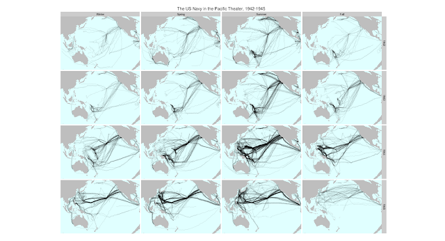
And the stuff is interesting. It's easy, for example,to pull out the locations of nearly the entire US Navy, season-by-season, in the Pacific Theater:
Click to enlarge.
Or even animate them and the less comprehensive Japanese records to show the tide of battle (America in blue, Japan in red):

Reading digital sources: a case study in ship's logs

[Temporary note, March 2015: those arriving from reddit may also be interested in this post, which has a bit more about the specific image and a few more like it.]

Digitization makes the most traditional forms of humanistic scholarship more necessary, not less. But the differences mean that we need to reinvent, not reaffirm, the way that historians do history.


This month, I've posted several different essays about ship's logs. These all grew out of a single post; so I want to wrap up the series with an introduction to the full set. The motivation for the series is that a medium-sized data set like Maury's 19th century logs (with 'merely' millions of points) lets us think through in microcosm the general problems of reading historical data. So I want in this post to walk through the various parts I've posted to date as a single essay in how we can use digital data for historical analysis.

The central conclusion is this: To do humanistic readings of digital data, we cannot rely on either traditional humanistic competency or technical expertise from the sciences. This presents a challenge for the execution of research projects on digital sources: research-center driven models for digital humanistic resource, which are not uncommon, presume that traditional humanists can bring their interpretive skills to bear on sources presented by others.

All voyages from the ICOADS US Maury collection. Ships tracks in black, plotted on a white background, show the outlines of the continents and the predominant tracks on the trade winds. 


We need to rejuvenate three traditional practices: first, a source criticism that explains what's in the data; second, a hermeneutics that lets us read data into a meaningful form; and third, situated argumentation that ties the data in to live questions in their field.

Wednesday, November 14, 2012

Where are the individuals in data-driven narratives?

Note: this post is part 5 of my series on whaling logs and digital history. For the full overview, click here.

In the central post in my whaling series, I argued data presentation offers historians an appealing avenue for historical argumentation, analogous in importance to the practice of shaping personal stories into narratives in more traditional histories. Both narratives and data presentations can appeal to a broader public than more technical parts of history like historiography; and both can be crucial in making arguments persuasive, although they rarely constitute an argument in themselves. But while narratives about people ensure that histories are fundamentally about individuals, working with data generally means we'll be dealing with aggregates of some sort. (In my case, 'voyages' by 'whaling ships'.*)

*I put those in quotation marks because, as described at greater length in the technical methodology post, what I give are only the best approximations I could get of the real categories of oceangoing voyages and of whaling ships.

This is, depending on how you look at it, either a problem or an opportunity. So I want to wrap into this longer series a slightly abtruse--technical from the social theory side rather than the algorithmic side--justification for why we might not want to linger over individual experiences.

One major reason to embrace digital history is precisely that it lets us tell stories that are fundamentally about collective actions--the 'swarm' of the whaling industry as a whole--rather than traditional subjective accounts. While it's discomforting to tell histories without individuals, that discomfort is productive for the field; we need a way to tell those histories, and we need reminders they exist. In fact, those are just the stories that historians are becoming worse and worse at telling, even as our position in society makes us need them more and more.

Friday, November 2, 2012

When you have a MALLET, everything looks like a nail

Note: this post is part 4, section 2 of my series on whaling logs and digital history. For the full overview, click here.

One reason I'm interested in ship logs is that they give some distance to think about problems in reading digital texts. That's particularly true for machine learning techniques. In my last post, an appendix to the long whaling post, I talked about using K-means clustering and k-nearest neighbor methods to classify whaling voyages. But digital humanists working with texts hardly ever use k-means clustering; instead, they gravitate towards a more sophisticated form of clustering called topic modeling, particularly David Blei's LDA (so much so that I'm going to use 'LDA' and 'topic modeling' synonymously here). There's a whole genre of introductory posts out there encouraging humanists to try LDA: Scott Weingart's wraps a lot of them together, and Miriam Posner's is freshest off the presses.

So as an appendix to that appendix, I want to use ship's data to think about how we use LDA. I've wondered for a while why there's such a rush to make topic modeling into the machine learning tool for historians and literature scholars. It's probably true that if you only apply one algorithm to your texts, it should be LDA. But most humanists are better off applying zero clusterings, and most of the remainder should be applying several. I haven't mastered the arcana of various flavors of topic modeling to my own satisfaction, and don't feel qualified to deliver a full-on jeremiad against its uses and abuses. Suffice it to say, my basic concerns are:

  1. The ease of use for LDA with basic settings means humanists are too likely to take its results as 'magic', rather than interpreting it as the output of one clustering technique among many.
  2. The primary way of evaluating its result (confirming that the top words and texts in each topic 'make sense') ignores most of the model output and doesn't map perfectly onto the expectations we have for the topics. (A Gary King study, for example, that empirically ranks document clusterings based on human interpretation of 'informativeness' found Direchlet-prior based clustering the least effective of several methods.)

Ship data gives an interesting perspective on these problems. So, at the risk of descending into self-parody, I ran a couple topic models on the points in the ship's logs as a way of thinking through how that clustering works. (For those who only know LDA as a text-classification system, this isn't as loony as it sounds; in computer science, the algorithm gets thrown at all sorts of unrelated data, from images to music).

Instead of using a vocabulary of words, we can just use one of latitude-longitude points at decimal resolution. Each voyage is a text, and each day it spends in, say, Boston is one use of the word "42.4,-72.1". That gives us a vocabulary of 600,000 or so 'words' across 11,000 'texts', not far off a typical topic model (although the 'texts' are short, averaging maybe 30-50 words). Unlike k-means clustering, a topic model will divide each route up among several topics, so instead of showing paths, we can visually only look at which points fall into which 'topic'; but a single point isn't restricted to a single topic, so New York could be part of both a hypothetical 'European trade' and 'California trade' topic.

With words, it's impossible to meaningfully convey all the data in a topic model's output. Geodata has the nice feature that we can inspect all the results in a topic by simply plotting them on a map. Essentially, 'meaning' for points can be firmly reduced a two-dimensional space (although it has other ones as well), while linguistic meaning can't.

Here's the output of a model, plotted with high transparency so that a point on the map will appear black if it appears in that topic in 100 or more log entries. (The basic code to build the model and plot the code is here--dataset available on request).


Click to enlarge

Thursday, November 1, 2012

Machine Learning at sea

Note: this post is part 4 of my series on whaling logs and digital history. For the full overview, click here.

As part of my essay visualizing 19th-century American shipping records, I need to give a more technical appendix on machine learning: it discusses how I classified whaling vessels as an example of how supervised and unsupervised machine learning algorithms, including the ubiquitous topic modeling, can help work with historical datasets.

For context: here's my map that shows shifting whaling grounds by extracting whale voyages from the Maury datasets. Particularly near the end, you might see one or two trips that don't look like whaling voyages; they probably aren't. As with a lot of historical data, the metadata is patchy, and it's worth trying to build out from what we have to what's actually true. To supplement I made a few leaps of faith to pull whaling trips out of the database: here's how.


Tuesday, October 30, 2012

Data narratives and structural histories: Melville, Maury, and American whaling

Note: this post is part I of my series on whaling logs and digital history. For the full overview, click here.

Data visualizations are like narratives: they suggest interpretations, but don't require them. A good data visualization, in fact, lets you see things the interpreter might have missed. This should make data visualization especially appealing to historians. Much of the historian's art is turning dull information into compelling narrative; visualization is useful for us because it suggests new ways of making interesting the stories we've been telling all along. In particular: data visualization lets us make historical structures immediately accessible in the same way that narratives have let us do so for stories about individual agents.

I've been looking at the ship's logs that climatologists digitize because it's a perfect case of forlorn data that might tell a more interesting story. My post on European shipping gives more of the details about how to make movies from ship's logs, but this time I want to talk about why, using a new set with about a half-century of American vessels sailing around the world. It looks like this:


I'll repost this below the break with a bit more of an explanation. First I want to ask some basic questions: If this is a narrative, what kind of story does it tell? And how compelling can a story from data alone be: is there anything left from a view so high that no individuals are present?

Thursday, October 18, 2012

Word counts rule of thumb

Here's a special post from the archives of my 'too-boring for prime time' files. I wrote this a few months ago but didn't know if anyone needed: but now I'll pull it out just for Scott Weingart since I saw him estimating word counts using 'the,' which is exactly what this post is about. If that sounds boring to you: for heaven's sake, don't read any further.

Melville Plots

Note: this post is part III of my series on whaling logs and digital history. For the full overview, click here.

The main thrust of my big post on the Maury logs is against using them to try to tell individual stories. But in the interests of Internet Melvilleiana, there are two particular tracks I want to pull out.

The first is the Acushnet, the whaling ship Herman Melville served on for 18 months. It was there he got the bulk of his first-hand experience whaling. Melville's track winds mostly around the old American whaling grounds off the coast of South America: you can see that had he stayed aboard a bit longer, the chase for Moby Dick might have entered colder waters. (And we might have a 19th-century account of Aleutian islands as strange as the Encantadas are of the Galapagos).


Friday, October 12, 2012

Logbooks and the long history of digitization

Note: this post is part II of my series on whaling logs and digital history. For the full overview, click here.

To read the data in ship's logs we first must know where the data came from. The short answer--ICOADS--might be enough. But working with digitized books has convinced me that knowing the full provenance of your data, through all its twists and turns, is one of the most important parts of any digital humanities project.

Like most humanists, the real digitization projects I care about are books, periodicals, and archives.  A major theme on this blog is the attempt to understand how particular choices in digitization history shape the books available to us.

But ship's logs are interesting because they present a wholly alternate digitization history that can help us understand the mechanics of digitization more clearly. Logs are a digitized data source that has been driving large-scale research projects for  more than 150 years: because of that, they can be a useful abstraction for reflecting on what digitization means. Logbook digitization is an interesting process in its own right; the particular cast of characters--Confederate technocrats, Nazi data thieves--in the history of shipping logs is unique. But the general problems are the same as those found in other large-scale sources of data. Unless humanists intend only to work with data digitized by our own standards, we have to be better at understanding just what can go wrong.

So before I get to those Nazis, let me lay out the basic themes that the story reinforces.

Tuesday, September 25, 2012

Advertising and politics

-->
I've now seen a paragraph about advertising in Jill Lepore's latest New Yorker piece in a few places, including Andrew Sullivan's blog. Digital history blogging should resume soon, but first some advertising history, since something weird is going on here:
Political consulting is often thought of as an offshoot of the advertising industry, but closer to the truth is that the advertising industry began as a form of political consulting. As the political scientist Stanley Kelley once explained, when modern advertising began, the big clients were just as interested in advancing a political agenda as a commercial one. Monopolies like Standard Oil and DuPont looked bad: they looked greedy and ruthless and, in the case of DuPont, which made munitions, sinister. They therefore hired advertising firms to sell the public on the idea of the large corporation, and, not incidentally, to advance pro-business legislation.
I can see why this paragraph seemed interesting enough to print. It offers a counter-intuitive spin on the role of advertising—and business in general—in the history of American politics. No one likes advertisers, no one likes political consultants, and they seem somewhow connected. But although we’re tempted to blame some modern debasement of politics on the over-reach of consumer culture, this suggests a much more direct approach: in fact, the subversion of politics was the goal of big industry all along, and the anti-consumerist clichés about consumerism only make us ignore that big fact.
Unfortunately, though, it has nothing to do with the actual history of advertising. Standard Oil and DuPont were not the 'big clients' of the advertising agencies, and the industry's roots have little to with the corporate image-making. For example: browse through the files, paying attention to size and year, in the portfolios of J Walter Thompson to see who was paying their bills in the 1920s and 1930s. Or just trust me: it's far and away consumer goods, companies like Quaker Oats, Lever Brothers soap, and Kraft foods.

Tuesday, July 31, 2012

The Wide World of Physics

I've been thinking more than usual lately about spatially representing the data in the various Bookworm browsers.

So in this post, I want to do two things:

First, give a quick overview of the geography of the ArXiv. This is interesting in itself--the ArXiv is the most comprehensive source of scientific papers for physics and mathematics, and plays a substantial role in some other fields. And it's good for me going forward, as a way to build up some code that can be used on other collections.

Second, to put some code online. I've been doing most of my work lately--writing as well as coding--in RStudio using Yihui Xie's fantastic Knitr package. The idea is to combine code with text to allow, simultaneously, literate programming and reproducible research. Blogger is pain: but all the source and text for this post is up at the Rpubs site, which is a very interesting project encouraging sharing research. You can go read this post there instead of here if you want code, but there are a few small changes. And the youtube clip is only available here.

The basic idea--to jump ahead a bit--is that it might be useful to create charts like the following, which show differing geographical patterns of usage. (Here, people talk about Harvard near Harvard, and Stanford near Stanford--but in Europe, Stanford seems to win out near the big particle physics projects in Italy and Switzerland.)

Click to enlarge
How we do that--and what we get from it--are both a little tricky.

Thursday, July 12, 2012

Making and publishing history in the Civil War

A follow up on my post from yesterday about whether there's more history published in times of revolution. I was saying that I thought the dataset Google uses must be counting documents of historical importance as history: because libraries tend to shelve in a way that conflates things that are about history and things that are history.

I realized after posting that the first of the two graphs in Michael Witmore and Robin Valenza's post actually shows a spike in publications of US history somewhere near 1860. (It actually looks closer to the late 1850s, but there aren't any grid lines on the chart.) Bookworm is pretty much useless in the 17th century, but it's on solid ground in the 1860s. And I've long known there was something funny going in Bookworm around the Civil War, particularly in the History class.

So--is there more history published in the Civil War period in the Bookworm database? What kind?

Wednesday, July 11, 2012

Do revolutionaries really read history?

A quick post about other people's data, when I should be getting mine in order:

[Edit--I have a new post here with some concrete examples from the US Civil War of the pattern described in this post]

Michael Witmore and Robin Valenza have a post up on the Wine Dark Sea about how the kinds of books that are published can give us fascinating windows on the intellectual climate in moments of historical change. I (of course) agree strongly with this. But I want to offer an alternative, and somewhat deflating, interpretation of the central evidence they use.

Their post uses the following plot (presented by Google's Jon Orwant at a meeting with humanists) as evidence that more books about history are published (and therefore read--a difficult but not completely unwarranted leap) in periods of great revolutionary change. This jumps out, particularly,  at the English and French revolutions. The chart shows this in "general and old world history":


Joe Adelman suggests a number of problems with using book publication as a metric: several are accurate. I could offer a few more questions (eg: where's 1848?); but none would unsettle the central point. It would be, as Witmore and Valenza say, very interesting if "publishers are offering more history for readers who, perhaps, think of themselves as living through important historical changes." Even if only in those two periods.

My guess, though, is that we're seeing an artifact of data here, and not history. Here's why:

Tuesday, May 8, 2012

Women in the libraries

It's pretty obvious that one of the many problems in studying history by relying on the print record is that writers of books are disproportionately male.

Data can give some structure to this view. Not in the complicated, archival-silences filling way--that's important, but hard--but just in the most basic sense. How many women were writing books? Do projects on big digital archives only answer, as Katherine Harris asks, "how do men write?" Where were gender barriers strongest, and where weakest? Once we know these sorts of things, it's easy to do what historians do: read against the grain of archives. It doesn't matter if they're digital or not.

One of the nice things about having author gender in Bookworm is that it opens a new way to give rough answers to these questions. Gendered patterns of authorship vary according to social spaces, according to time, according to geography: a lot of the time, the most interesting distinctions are comparative, not absolute. Anecdotal data is a terrible way to understand comparative levels of exclusion; being able to see rates across different types of books adds a lot to the picture.

In this post, I'm going to run through a lot of basic metadata about the gender composition of libraries very quickly, because I need to know it to work with this data. Although this is the bookworm database, the rules for inclusion in Bookworm are so simple (Open Library page, Internet Archive downloadable file) that at least up to 1922, the results here should be broadly similar to any large selection of texts that draws heavily from the Google library-scanning project. (Most notably: HathiTrust and Google Books). And those are so similar to the composition of the university libraries that humanists have been using for decades, that even non-digital researchers should have some use for similar statistics.

More interesting findings might come out of more complicated questions about interrelations among all these patterns: lots of questions are relatively easy to answer with the data at hand. (If you want to download it, it's temporarily here. For entertainment purposes only, etc., etc.)

The most basic question is: what percentage of books are by women? How did that change? (Of course, we could flip this and ask it about men--this data analysis is going to be clearer if we treat women as the exceptional group). Here's a basic estimate: as the chart says, post-1922 results are unreliable. The takeaway: something like 5% at midcentury, up to about 15% by the 1920s.

Monday, May 7, 2012

Author Genders: methodology

We just rolled out a new version of Bookworm (now going under the name "Bookworm Open Library") that works on the same codebase as the ArXiv Bookworm released last month. The most noticeable changes are a cleaner and more flexible UI (mostly put together for the ArXiv by Neva Cherniavksy and Martin Camacho, and revamped by Neva to work on the OL version), couple with some behind-the-scenes tweaks that should make it easy to add new Bookworms on other sets of texts in the future. But as a little bonus, there's an additional metadata category in the Open Library Bookworm we're calling "author gender."

I don't suppose I need to tell anyone that gender has been an important category to the humanities over the last few decades. But it's been important in a way that makes lump categories like this highly fraught, so I want to be slightly careful about this. I'll do that in two posts: this one, explaining the possibilities and limits of the methodology; and a follow-up that actually crunches the data to look at how library holdings, and some word usages, break down by gender.

Friday, April 27, 2012

Publishing Libraries

[The American Antiquarian Society conference in Worcester last weekend had an interesting rider on the conference invitation--they wanted 500 words from each participant on the prospects for independent research libraries. I'm posting that response here.]

Here's the basic idea:


Monday, April 9, 2012

Visualizing Ocean Shipping

I saw some historians talking on Twitter about a very nice data visualization of shipping routes in the 18th and 19th centuries on Spatial Analysis. (Which is a great blog--looking through their archives, I think I've seen every previous post linked from somewhere else before).

They make a basically static visualization. I wanted to see the ships in motion. Plus, Dael Norwood made some guesses about the increasing prominence of Pacific trade in the period that I would like to see confirmed. That got me interested with the ship data that they use, which consists of detailed logbooks that have been digitized for climatological purposes. On the more technical side, I have been fiddling a bit lately with ffmpeg and ggplot (two completely unrelated systems, despite what the names imply) to make animated visualizations, and wanted to put one up. And it's an interesting case; historical data was digitized for climatological purposes, which means visualization is going to be on of the easiest ways to think about whether it might be usable for historical demonstration or analysis, as well.

So here are two visualizations.

[Update 11/12: For more of this, see my discussion of American shipping, and whaling in particular, from 1800 to 1860.]

The first one is long: it shows about 100 years of ship paths in the seas, as recorded in hundreds of ship's log books, by hand, one or several times a day. I haven't watched the whole thing at once, but skipping around gives a pretty good idea of the state of the database (if not world shipping) at any given moment.


You can watch either of these in much higher resolution by clicking around here or on YouTube--I definitely recommend 720p.

This shows mostly Spanish, Dutch, and English routes--they are surprisingly constant over the period (although some empires drop in and out of the record), but the individual voyages are fun. And there are some macro patterns--the move of British trade towards India, the effect of the American Revolution and the Napoleonic Wars, and so on.

The second has to do with seasonality: it compresses all those years onto a single span of January-December, to reveal seasonal patterns. I loop through a couple times so you can get a better sense, but the data is the same for each year.

Wednesday, April 4, 2012

Turning off the TV


I'm starting up a new blog, QwiksterProchronism (an obscure near-synonym for 'anachronism') for anything I want to post about  TV/movie related anachronisms and historical language. There are two new posts up there right now: on the season premiere of Mad Men and Sunday's night's episode.

People are interested in TV anachronisms, and I find the patterns it unveils really interesting for understanding language change. (A lot of my dissertation research focuses on just the sort of below-the-radar language changes). But I made this blog for working with large textual sources and posting occasional off-the-cuff rants about digital humanities, and the posts have gotten longer with time. I don't want swamp it with too much about television. Minor week-by-week rundowns of Mad Men would fall under that category, as would random Deadwood visualizations and a bunch of other things I have sitting around and may want to dole out.

I think we could have a mildly interesting discussion about the role of TV and film criticism in the digital humanities, which retains a bit of stodginess about its subject matter in order to secure acceptance for its methodologies. (I tend to think this is a wise bit of strategic positioning, but am open to the opposite perspective). Though I do have a fair amount of early broadcasting history in my dissertation, I can't bring myself to do a full-throated defense of writing about TV right now and passing it up as a somehow academic endeavor--chalk me up as part of the problem.

I'll probably follow the Andrew Gelman model and crosspost on some things with dual relevance. So whenever I get around to savaging Edith Wharton for her tin ear in The Age of Innocence, it will be here as well.

Monday, April 2, 2012

Digital Collections, Research Libraries, Collaboration

[The following is a revised version of my talk on the 'collaboration' panel at a conference about "Needs and Opportunities for the Research Library in the Digital Age" at the American Antiquarian Society in Worcester last week. Thanks to Paul Erickson for the invitation to attend, and everyone there for a fascinating weekend.]

As a few people here have suggested, there's a lot to be suspicious of in the foisting of collaboration on unsuspecting researchers. To those worries about collaboration that have already been brought up (including by myself elsewhere), I'd add the particular suspicions that early-career scholars often bear. Collaboration is often one of those ambitious things that successful scholars only seem to turn to in earnest with the security of tenure, like transnational history or raising children.

But in the last few years, I've turned more and more to working with digital sources; and in doing so, it turns out collaboration is essential. It's impossible to escape. And, as everyone says, it really is wonderful.

But the forms that digital collaboration takes, particularly when it's most helpful, are very different than the traditional forms of heady engagement around a shared codex, blackboard, or meal that tend to get us most sentimental when talking about collaborative work. And that has important implications for libraries like this, because it suggests that the way you find your collaborators may be quite different. In some cases, you may not even know who they are. And the attributes it takes to attract these invisible collaborators can be quite different from those that libraries traditionally try to display, though they remain one that a library like this may have in abundance.


Wednesday, March 21, 2012

Mad Men anachronism hunting

[Update: I've consolidated all of my TV anachronisms posts at a different blog, Prochronism, and new ones on Mad Men, Deadwood, Downton Abbey, and the rest are going there.]

I've got an article up today on the Atlantic's web site about how Mad Men stacks up against historical language usage. So if you're reading this blog, go read that.

Maybe I'll add some breakouts of individual episodes later today if I get some time, but here are the overall word clouds like the ones I made for Downton Abbey. Mad Men has noticeably fewer outliers towards the top:


And the ones that are are actually appropriate. (My dissertation actually has a bit on the origins of focus groups in the 1940s).

Tuesday, March 6, 2012

Do women hide their gender by publishing under their initials?

A quick follow-up on this issue of author gender.


In my last post, I looked at first names as a rough gauge of author gender to see who is missing from libraries. This method has two obvious failings as a way of finding gender:

1) People use pseudonyms that can be of the opposite gender. (More often women writing as men, but sometimes men writing as women as well.)

2) People publish using initials. It's pretty widely known that women sometimes publish under their initials to avoid making their gender obvious.

The first problem is basically intractable without specific knowledge. (I can fix George Eliot by hand, but no other way). The second we can get actually get some data on, though. Authors are identified by their first initial alone in about 10% of the books I'm using (1905-1922, Open Library texts). It turns out we can actually figure out a little bit about what gender they are. If this is a really important phenomenon in the data, then it should show up in other ways.

Evidence of absence is not absence of evidence

I just saw that various Digital Humanists on Twitter were talking about representativeness, exclusion of women from digital archives, and other Big Questions. I can only echo my general agreement about most of the comments.

But now that I see some concerns about gender biases in big digital corpora, I do have a bit to say. Partly that I have seen nothing to make me think social prejudices played into the scanning decisions at all. Rather, Google Books, Hathi Trust, the Internet Archive, and all the other similar projects are pretty much representative of the state of academic libraries. (With strange exceptions, of course). You can choose where to vaccum, but not what gets sucked up the machine; likewise the companies.

Wednesday, February 29, 2012

Journal of Irreproduced results, vol. 1

I wanted to try to replicate and slightly expand Ted Underwood's recent discussion of genre formation over time using the Bookworm dataset of Open Library books. I couldn't, quite, but I want to just post the results and code up here for those who have been following that discussion. Warning: this is a rather dry post.

Monday, February 20, 2012

Downton Abbey Anachronisms, Season Finale edition

[Update: I've consolidated all of my TV anachronisms posts at a different blog, Prochronism, and new ones on Mad Men, Deadwood, Downton Abbey, and the rest are going there.]

It's Monday, so let's run last night's episode of Downton Abbey through the anachronism machine. I looked for Downton Abbey anachronisms for the first time last week: using the Google Ngram dataset, I can check every two-word phrase in an episode to see if it's more common today than then. This 1) lets us find completely anachronistic phrases, which is fun; and 2) lets us see how the language has evolved, and what shows do the best job at it. [Since some people care about this--don't worry, no plot spoilers below].

I'll start this with a chart of every two-word phrase that appears in the episode, just like last time. Left-to-right is overall frequency; top to bottom is over-representation. Higher up is representative of 1995 language; lower down, of 1917. Click to enlarge.


So: how does it look?

Sunday, February 19, 2012

Second epistle to the intellectual historians

I. The new USIH blogger LD Burnett has a post up expressing ambivalence about the digital humanities because it is too eager to reject books. This is a pretty common argument, I think, familiar to me in less eloquent forms from New York Times comment threads. It's a rhetorically appealing position--to set oneself up as a defender of the book against the philistines who not only refuse to read it themselves, but want to take your books away and destroy them. I worry there's some mystification involved--conflating corporate publishers with digital humanists, lumping together books with codices with monographs, and ignoring the tension between reader and consumer. This problem ties up nicely into the big event in DH in the last week--the announcement of the first issue of the ambitiously all-digital Journal of Digital Humanities. So let me take a minute away from writing about TV shows to sort out my preliminary thoughts on books.

Monday, February 13, 2012

Making Downton more traditional

[Update: I've consolidated all of my TV anachronisms posts at a different blog, Prochronism, and new ones on Mad Men, Deadwood, Downton Abbey, and the rest are going there.]

Digital humanists like to talk about what insights about the past big data can bring. So in that spirit, let me talk about Downton Abbey for a minute. The show's popularity has led many nitpickers to draft up lists of mistakes. Language Loggers Mark Liberman and Ben Zimmer have looked at some idioms that don't belong for Language Log, NPR and the Boston Globe.) In the best British tradition, the Daily Mail even managed to cast the errors as a sort of scandal. But all of these have relied, so far as I can tell, on finding a phrase or two that sounds a bit off, and checking the online sources for earliest use. This resembles what historians do nowadays; go fishing in the online resources to confirm hypotheses, but never ever start from the digital sources. That would be, as the dowager countess, might say, untoward.

I lack such social graces. So I thought: why not just check every single line in the show for historical accuracy? Idioms are the most colorful examples, but the whole language is always changing. There must be dozens of mistakes no one else is noticing. Google has digitized so much of written language that I don't have to rely on my ear to find what sounds wrong; a computer can do that far faster and better. So I found some copies of the Downton Abbey scripts online, and fed every single two-word phrase through the Google Ngram database to see how characteristic of the English Language, c. 1917, Downton Abbey really is.

The results surprised me. There are, certainly, quite a few pure anachronisms. Asking for phrases that appear in no English-language books between 1912 and 1921 gives a list of 34 anachronistic phrases this season. Sorted from most to least common in contemporary books, we get a rather boring list:

Thursday, February 2, 2012

Poor man's sentiment analysis

Though I usually work with the Bookworm database of Open Library texts, I've been playing a bit more with the Google Ngram data sets lately, which have substantial advantages in size, quality, and time period. Largely I use it to check or search for patterns I can then analyze in detail with text-length data; but there's also a lot more that could be coming out of the Ngrams set than what I've seen in the last year.

Most humanists respond to the raw frequency measures in Google Ngrams with some bafflement. There's a lot to get excited about internally to those counts that can help answer questions we already have, but the base measure is a little foreign. If we want to know about the history of capitalism, the punctuated ascent of its Ngram only tells us so much:

It's certainly interesting that the steepest rises, in the 1930s and the 1970s, are associated with systematic worldwide crises--but that's about all I can glean from this, and it's one more thing than I get from most Ngrams. Usually, the game is just tracing individual peaks to individual events; a solitary quiz on historical events in front of the screen. Is this all the data can tell us?

Monday, January 30, 2012

Fixing the job market in two modest steps

Another January, another set of hand-wringing about the humanities job market. So, allow me a brief departure from the digital humanities. First, in four paragraphs, the problem with our current understanding of the history job market; and then, in several more, the solution.

Tony Grafton and Jim Grossman launched the latest exchange with what they call a "modest proposal" for expanding professional opportunities for historians. Jesse Lemisch counters that we need to think bigger and mobilize political action. There's a big and productive disagreement there, but also a deep similarity: both agree there isn't funding inside the academy for history PhDs to find work, but think we ought to be able to get our hands on money controlled by someone else. Political pressure and encouraging words will unlock vast employment opportunities in the world of museums, archives, and other public history (Grafton) or government funded jobs programs (Lemisch). These are funny places to look for growth in a 21st-century OECD country (perhaps Bill Cronon could take the more obvious route, and make his signature initiative as AHA president creating new tenure-track jobs in the BRICs?) but the higher levels of the profession don't see much choice but to change the world.

Thursday, January 5, 2012

Practices, the periphery, and Pittsburg(h)

[This is not what I'll be saying at the AHA on Sunday morning, since I'm participating in a panel discussion with Stefan Sinclair, Tim Sherrat, and Fred Gibbs, chaired by Bill Turkel. Do come! But if I were to toss something off today to show how text mining can contribute to historical questions and what sort of issues we can answer, now, using simple tools and big data, this might be the story I'd start with to show how much data we have, and how little things can have different meanings at big scales...]

Spelling variations are not a bread-and-butter historical question, and with good reason.  There is nothing at stake in whether someone writes "Pittsburgh" or "Pittsburg." But precisely because spelling is so arbitrary, we only change it for good reason. And so it can give insights into power, center and periphery, and transmission. One of the insights of cultural history is that the history of practices, however mundane, can be deeply rooted in the history of power and its use. So bear with me through some real arcana here; there's a bit of a payoff. Plus a map.

The set-up: until 1911, the proper spelling of Pittsburg/Pittsburgh was in flux. Wikipedia (always my go-to source for legalistic minutia) has an exhaustive blow-by-blow, but basically, it has to do with decisions in Washington DC, not Pittsburgh itself (which has usually used the 'h'). The city was supposedly mostly "Pittsburgh" to 1891, when the new US Board on Geographic Names made it firmly "Pittsburg;" then they changed their minds, and made it and once again and forevermore "Pittsburgh" from 1911 on. This is kind of odd, when you think about it: the government changed the name of the eighth-largest city in the country twice in twenty years. (Harrison and Taft are not the presidents you usually think of as kings of over-reach). But it happened; people seem to have changed the addresses on their envelopes, the names on their baseball uniforms, and everything else right on cue.

Thanks to about 500,000 books from the Open Library, though, we don't have to accept this prescriptive account as the whole story; what did people actually do when they had to write about Pittsburgh?

Here's the usage in American books:

What does this tell us about how practices change?